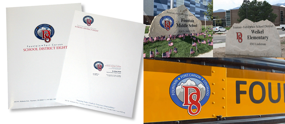
Fountain Ft. Carson School District 8
We worked with Fountain Ft. Carson School Dist. 8 to develop a new brand for the district. This included a new logo, corporate identity, marketing collateral, branded vehicle wraps, clothing and a marketing video. This logo was designed to encompass both the civilian and the military sector District 8 services.
We were honored with a Hermes Creative Award and a local Addy award.
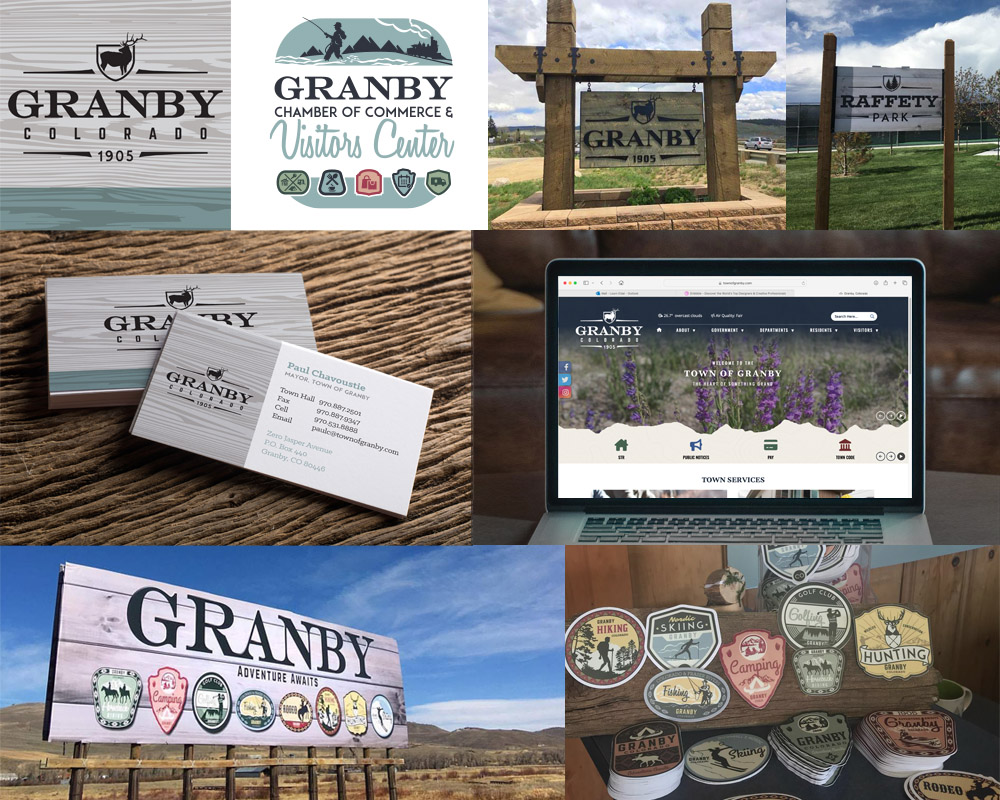
Town of Granby, CO
Crystal Peak worked with the Mayor, the Council and community of Granby Colorado on the re-branding of their town. This included new logo, signage, and marketing strategy that represents the town’s western heritage. The new look communicates that heritage in a unified approach, continuing the use of barn wood and iron lettering in a modern western aesthetic, raising the overall impression of the town. A committee made up of citizens and downtown business owners offered input. A cohesive brand can create pride for residents that choose to call Granby home, and gives visitors a lasting positive impression of a great town they visited. The committee created individual “badge” stickers, representing various local activities, as a component of a larger marketing strategy. These stickers can be collected in a scavenger hunt and give people something to take home that show all of the fun things to do in the area.
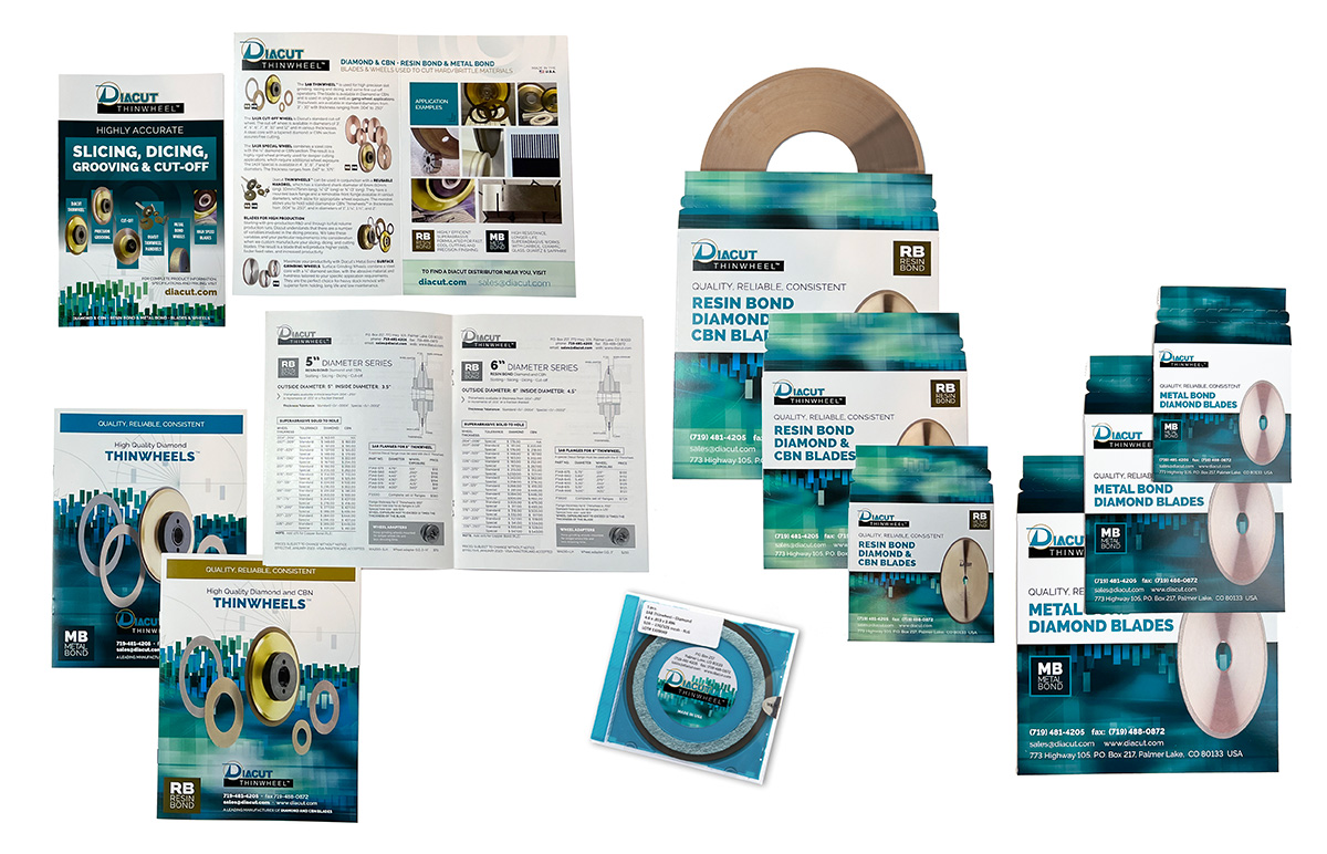
Diacut, Inc.
Diacut is a manufacturer of Diamond and CBN blades, which are vital to a wide variety of industries including precision machining, tool and die, ceramics, electronics, photonics and optics. Diacut, Inc. supplies their quality blades and flanges to many of these industries world-wide for use in precision slot grinding, grooving, cut-off and slicing & dicing operations. Following a branding refresh we completed for Diacut, we have produced updated price sheets and catalogs, mailers, branded blade sleeves, and stickers.
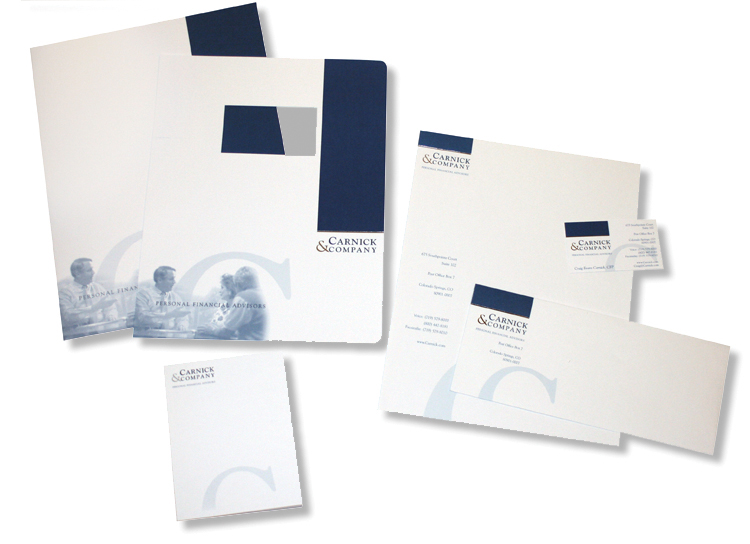
Carnick & Kubik
Carnick & Kubik is a personal wealth advisor in the Colorado Springs and Denver area. Crystal Peak Design developed an updated logo and corporate identity for Carnick & Kubik, formerly known as Carnick & Company. This included business cards, letterhead, business envelopes and regular mailing envelopes, report covers, pocket folders, note pads and more.
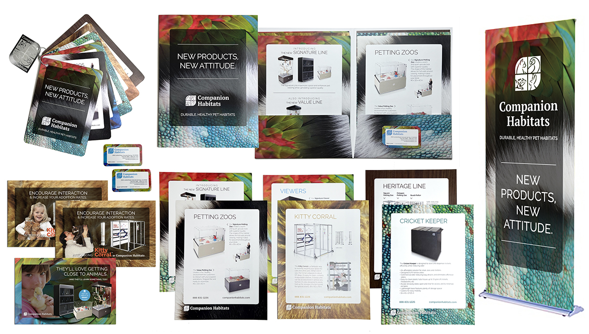
Companion Habitats
Since Companion Habitats inception in 1986, they were devoted to providing the pet, zoo and shelter industries with unique and exceptional-quality bird, reptile and small animal commercial habitat fixtures. Their distinctive, award-winning designs established them as the premier commercial habitat provider. Their work had been on display throughout the world, at zoos, hotels, shelters, neighborhood pet stores and large national pet store chains. After many years of collaboration, Crystal Peak developed an updated logo and corporate identity for CH. This included business cards, presentation folders and inserts, a custom product brochure with chain bindery, postcard direct mailers and trade show banner stands.
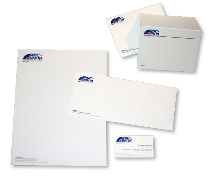
ABC Bank
Crystal Peak Design was hired to provide an updated look for American Bank of Commerce. Founded in 1962, ABC Bank started in Texas and expanded into Colorado. The goal was to take their existing logo and without changing the integrity of the logo, provide an updated look. We divided up the block look and developed accents to weave into the corporate identity.
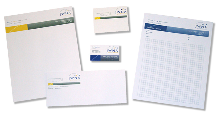
James Nakai & Associates
James Nakai & Associates is an architectural firm in Colorado Springs that hired us to updated the visual identity for their firm. We made some gentle edits their existing logo so it would have a better balance, and wove additional patterned and colored accents throughout their corporate identity. The project included architect pads, business cards, letterhead, envelopes and mailing labels.
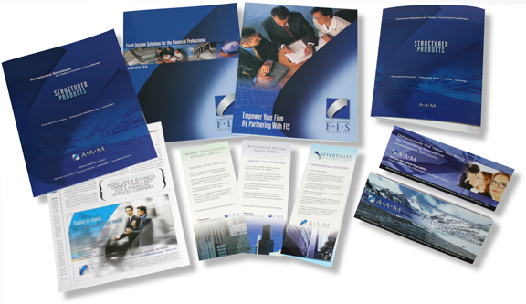
Fixed Income Securities
Crystal Peak Design was originally hired by Fixed Income Securities to develop a brochure for their firm. Based on the success of that project, a long time relationship was formed. Over many years Crystal Peak was hired to develop their marketing collateral, corporate identities and more. As their firm grew, they acquired more investment firms and changed their name to Advisors Asset Management. Crystal Peak was hired to do an update on their corporate identity to reflect the new name.
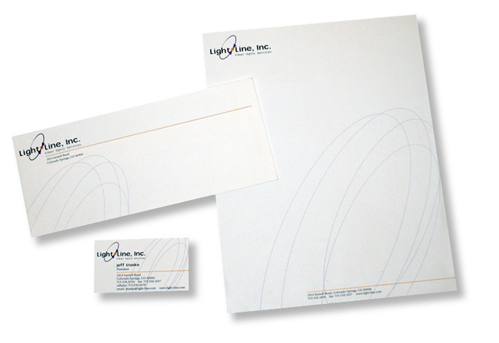
Light Line Inc.
Light Line, Inc. was a company located in the Colorado Springs area. To reflect their work with fiber optic cable, the logo we developed used a stylized version of the schematic symbol for a fiber optic connection. In addition to the logo, we developed their corporate identity. The package included concepts for hats, jackets, vehicle signage, business cards, letterhead and envelopes.